Homeowners often dream of creating spaces that feel both current and enduring. They want interiors that reflect their personal style without succumbing to fleeting trends. This desire for lasting elegance leads many to a fundamental design principle: the strategic use of neutral surface colors. These understated hues form the backbone of countless beautiful homes. They offer a quiet harmony that allows other elements to shine.
Neutral colors are shades lacking strong intensity or saturation [1]. They do not visually dominate a space. This makes them perfect as a foundation for any design style. Common neutral colors include white, beige, gray, black, cream, and taupe. Some expanded definitions also include deep tones like navy and earthy shades like brown [1]. Unlike bold or vibrant colors, neutrals are subtle and balanced. They allow other elements in a space to stand out.
This article will explore the enduring appeal of neutral surface colors. We will delve into their key characteristics. We will also provide practical advice for homeowners. This guide will help you create a timeless and sophisticated living environment.
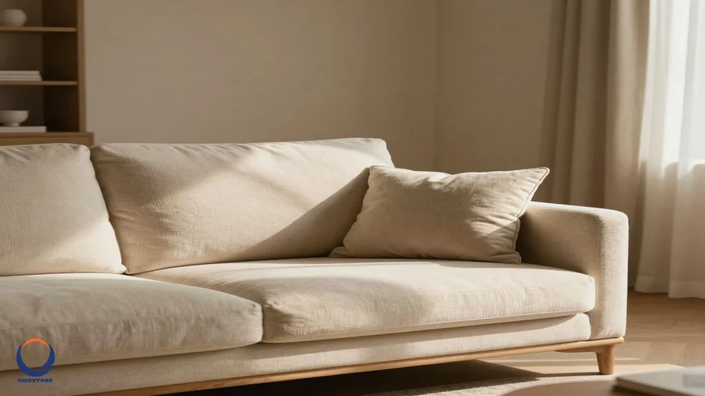
The enduring appeal of neutral surface colors
Neutral surface colors offer a unique combination of benefits. These qualities ensure their lasting popularity among homeowners. They provide a versatile foundation. They also create serene environments. Moreover, they enhance natural light.
Versatility and adaptability for every style
Neutral shades are celebrated for their remarkable adaptability [2]. They serve as a flexible canvas. This canvas can easily accommodate seasonal updates or bold accent pieces. It also handles shifting décor trends. Whether you are refreshing a living space or updating a room, neutrals simplify the process. They make it easy to introduce new textures, patterns, or pops of color without a complete overhaul. This versatility ensures neutrals remain a timeless choice. They seamlessly blend with both contemporary and classic styles [2]. They fit into any design aesthetic. This includes minimalist or eclectic vibes [3]. Neutrals combine effortlessly with other colors and prints. This allows homeowners to reinvent their spaces without major changes.
Creating calm and serene environments
The calming effect of neutral tones is another reason for their lasting appeal [3]. These colors evoke feelings of tranquility and relaxation. They are ideal for creating peaceful environments at home. In spaces where stress reduction is essential, such as bedrooms, neutrals foster a serene atmosphere [3]. They reduce visual noise [1]. When your eyes are not overwhelmed by too many competing colors, you notice finer details. This includes the grain of wood or the softness of fabric. This creates a sense of calm and clarity. Many associate this with high-end environments like luxury hotels or designer homes [1].
Enhancing natural light and maximizing space
Homeowners also appreciate how neutral tones amplify light in a space [3]. These colors reflect light instead of absorbing it. This ensures that rooms look brighter and airier. This quality is particularly handy in small spaces. Here, light needs to be maximized as much as possible [3]. As homes become smaller, the demand for light-maximizing designs increases. This keeps neutrals in vogue. They make any room feel more open and expansive. This is a crucial benefit for modern living.
Timelessness and longevity in design
Neutral colors provide a timeless elegance. This elegance goes beyond seasonal trends. Building a color palette around neutral tones is not just choosing safe colors. It is creating a timeless base. This base makes everything else look more intentional and cohesive more sophisticated. This approach aligns with a sustainability-conscious mindset. Homeowners increasingly invest in long-lasting pieces. They prefer these over fast-changing trends [3]. Neutral surfaces ensure that your home remains stylish for years to come. They offer a foundation that never feels dated. This is a significant advantage for long-term property value [5].
Key characteristics of neutral surface colors
Understanding the inherent qualities of neutral colors helps homeowners leverage their full potential. These characteristics are fundamental to their timeless appeal. They allow for both subtlety and impact in design.
Subtle intensity and saturation
Neutral colors are defined by their subtle undertones. They lack strong chromatic content [4]. Their universal appeal stems from their ability to blend effortlessly with any palette. This makes them the go-to choice for timeless elegance [4]. They create a harmonious backdrop. This backdrop allows accent colors and textures to shine. Their adaptability ensures they work well in both traditional and modern environments. Neutrals provide a sense of balance and calm. They form the backbone of countless successful design schemes. This subtle nature is what prevents visual fatigue.
A harmonious and adaptable backdrop
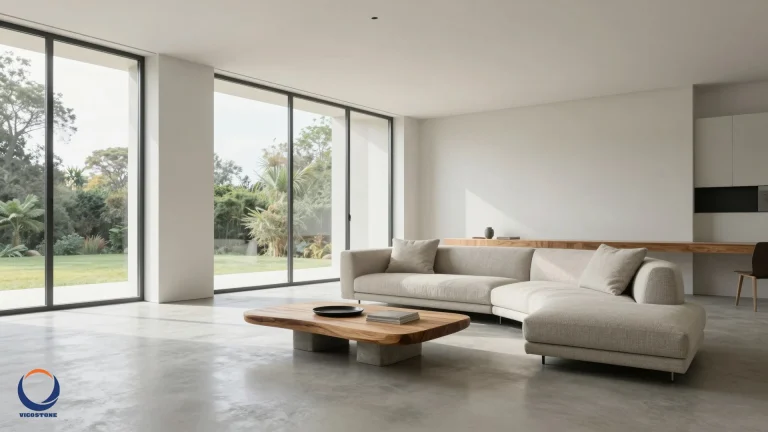
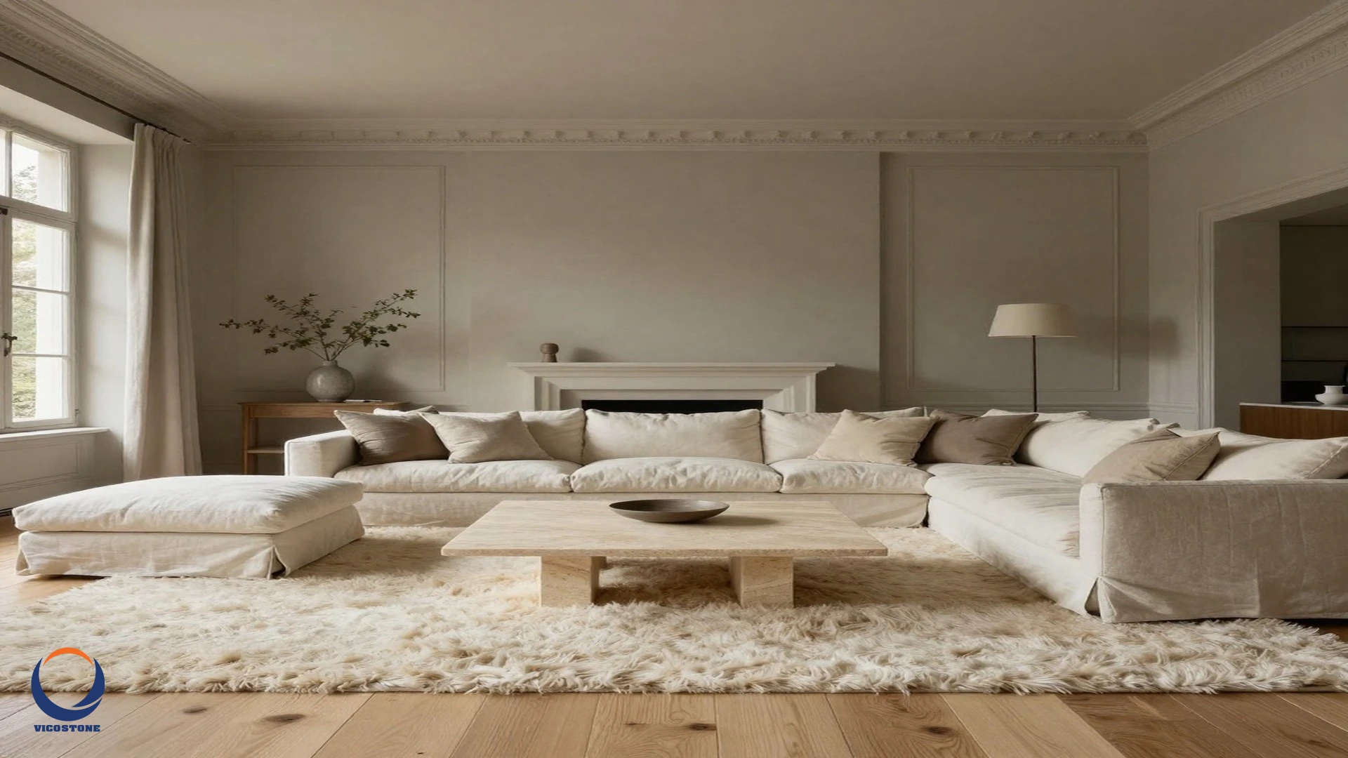
The primary role of neutral surface colors is to act as a unifying force. They tie together diverse design elements. Imagine soft beige walls, a cream sofa, and warm wood touches. This instantly feels calm and intentional [1]. Nothing is overwhelming. Yet, everything works together seamlessly. This principle applies to all surfaces. Think of neutral flooring, countertops, or wall finishes. They provide a cohesive look. This look can be easily updated with accessories. This adaptability is key to maintaining a fresh home without constant renovations.
Enhancing textures and materials
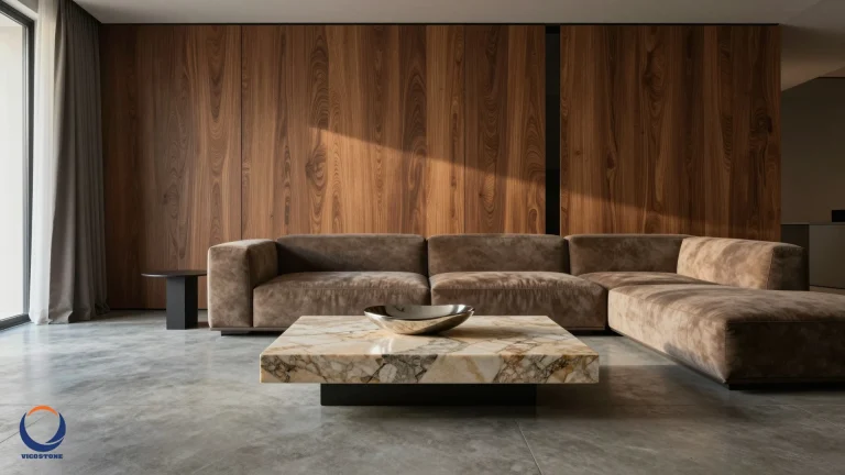
When working with a neutral palette, incorporating various textures and materials is key. It achieves visual interest and depth [2]. Mixing elements enriches both interiors and outfits. It ensures the end result feels dynamic instead of monotonous. Consider linen, wood, wool, leather, and stone. These materials look more refined when paired with understated tones [1]. Thoughtful layering of textures within neutral schemes prevents spaces from appearing flat or uninspired [2]. This allows the inherent beauty of materials to be appreciated. EON Tech recognizes the importance of material texture in creating sophisticated, lasting designs.
Effortless pairing with accents and pops of color
Enhancing a neutral backdrop is effortless with thoughtfully chosen accents [2]. Homeowners can incorporate pops of color. This can be done through artwork, cushions, or statement pieces. They can also introduce metallics. Gold, brass, or chrome add a touch of sophistication. Patterned accessories, such as rugs or throws, infuse energy and personality. These details break up monotony. They also allow you to customize your space. This reflects your unique style. Accents are essential for keeping neutral looks lively and engaging as suggested by Apartment Therapy. This flexibility is a major draw for homeowners.
Practical application for homeowners
Applying neutral surface colors effectively transforms a house into a timeless home. Thoughtful choices and layering techniques are crucial. They ensure a sophisticated and inviting environment.
Choosing the right neutral undertones
Achieving a harmonious and visually appealing space often depends on blending both warm and cool neutrals [2]. Warm tones like ivory, tan, or camel evoke comfort and coziness. Cool shades such as gray, slate, or greige bring sophistication and calm [2]. Mixing these undertones prevents the look from feeling flat or monotonous. Instead, it adds depth and interest. The interplay between warm and cool neutrals allows you to tailor environments to suit any mood or season as highlighted by Better Homes & Gardens. Consider the existing light in your room. Also, think about the overall mood you wish to create when selecting your neutrals.
Layering textures for visual depth
To avoid a bland neutral space, layering textures is paramount. Combine soft fabrics like linen or wool with hard surfaces. Examples include wood, stone, or metal. A soft wool throw on a sleek wooden table creates subtle contrast [2]. For surfaces, consider why surface texture matters in interior design. A polished countertop next to a matte cabinet finish adds interest. Varied textures prevent a room from feeling one-dimensional. They invite touch and add richness. This makes the space feel luxurious and well-considered.
Incorporating thoughtful accents and patterns
Accents are your opportunity to infuse personality. With a neutral backdrop, you can easily experiment. Change throw pillows, add vibrant artwork, or update curtains. Metallics like brushed nickel or antique brass can elevate a space. Patterned rugs or wallpapers introduce dynamic elements. These additions can be swapped out easily. This keeps your home feeling fresh without a major commitment. This strategy allows for endless customization. It maintains the timeless foundation of your neutral surfaces.
Considering durability and maintenance for surfaces
When selecting neutral surface materials, durability is a key factor. Homeowners want surfaces that stand the test of time. This includes both aesthetics and function. For high-traffic areas, materials like engineered stone offer excellent resilience. They maintain their appearance for years. This is especially true for kitchen countertops and bathroom vanities. Choosing how to choose the right countertop color for your interior style ensures both beauty and practicality. Low-maintenance surfaces are a smart investment. They contribute to the longevity of your timeless design.
Conclusion
Neutral surface colors are more than just a safe choice. They are a strategic design decision. They create homes that are effortlessly elegant and deeply inviting. Their versatility allows for endless personalization. Their calming presence fosters tranquility. Moreover, their ability to enhance natural light makes spaces feel larger and brighter. By embracing neutral surfaces, homeowners invest in a timeless foundation. This foundation will adapt to changing tastes and endure for generations. Ultimately, the "effortlessly elegant" look is about smart simplicity. It is about creating a cohesive and sophisticated living environment.
More Information
- Neutral Colors: Shades that lack strong intensity or saturation, serving as a non-dominant visual foundation. They typically include white, beige, gray, black, cream, and taupe, sometimes extending to navy and brown.
- Versatility: The ability of neutral colors to adapt to various design styles, seasonal changes, and accent pieces without requiring a complete overhaul of the space.
- Serenity: The calming effect evoked by neutral tones, contributing to feelings of tranquility and relaxation, making them ideal for creating peaceful and stress-reducing environments.
- Visual Noise: The distraction or overwhelming feeling caused by too many competing colors or elements in a space, which neutral palettes effectively reduce, allowing finer details to be noticed.
- Timeless Design: An aesthetic approach that prioritizes enduring style over fleeting trends, ensuring that interior choices remain relevant, elegant, and valuable over many years.