Interior design is more than just aesthetics. It is about creating an atmosphere. It shapes how people feel within a space. Designers carefully select elements to evoke specific emotions. Among these, color plays a pivotal role. Neutral tones, in particular, stand out. They are a fundamental choice for many professionals. These hues create timeless, versatile, and emotionally resonant environments.
Neutral palettes offer a canvas of calm. They provide a serene backdrop for daily life. This approach aligns with modern minimalist trends. Such trends prioritize simplicity and elegance [1]. Neutral designs aren't just about being plain. They craft spaces that promote peace, clarity, and balance. In a world full of visual noise, minimalist modern interior design offers a refreshing change [1]. It embraces open spaces and neutral tones. It also incorporates multifunctional furniture. This creates a deep connection to the surroundings.
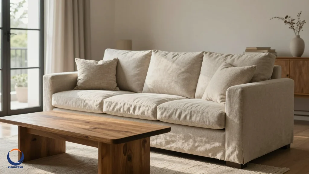
The psychology of neutral colors
Colors profoundly impact our mood. They also affect our physiological responses [4]. This is not just anecdotal; there is real science behind it. Our brains process color signals. These signals trigger hormones and neurotransmitters. These affect our mood and energy levels [4].
Warm colors, like reds, can increase heart rate. They stimulate the nervous system. This makes us feel energized. However, they can also cause agitation [4]. Conversely, cool colors have a calming effect. Blues and greens slow heart rate and breathing. They promote relaxation and peace [4]. Neutrals, such as whites, greys, and earthy tones, often lean towards this calming spectrum. They offer a sense of stability. They also provide a soothing visual experience.
Designers choose neutrals for their inherent tranquility. They establish a serene foundation. This allows other elements to shine. This approach creates a balanced environment. It fosters a feeling of well-being for occupants.
Versatility and adaptability in design
One of the primary reasons designers favor neutrals is their unmatched versatility. Neutral tones act as a blank canvas. They allow for endless possibilities in decor. You can easily introduce pops of color. You can also experiment with different textures. This is all possible without clashing with the base palette.
This adaptability is crucial for clients. It enables them to update their spaces. They can do this without expensive renovations. A neutral room can transform with new cushions. It can also change with different artwork or seasonal accessories. This makes neutral designs incredibly cost-effective in the long run. It also ensures longevity. A home designed with neutrals can evolve. It changes with the homeowner's tastes. It also adapts to changing trends.
Furthermore, neutrals appeal to a broader audience. They are often preferred in real estate. They help potential buyers envision themselves in the space. This broad appeal makes them a smart choice. It works for both residential and commercial projects. For instance, a minimalist approach often uses neutral colors. This allows for clear lines and purposeful design [2].
Creating timeless elegance
Trends come and go. Yet, some design principles endure. Neutral tones embody this enduring quality. They resist the fleeting nature of fashion. This makes them a cornerstone of timeless design. Spaces built on a neutral foundation never look dated. They maintain a sophisticated and classic appeal.
The association of neutrals with luxury is also strong. High-end interiors frequently feature muted palettes. These palettes exude understated elegance. They focus on quality materials and craftsmanship. The simplicity of neutrals allows these elements to take center stage. This creates a sense of quiet luxury. It speaks volumes without being ostentatious. Why surface simplicity defines quiet luxury interiors is a concept many designers embrace.
A neutral scheme provides a calm backdrop. It allows architectural details to shine. It also highlights curated furnishings. This careful balance results in a space. It feels both current and enduring. It is a testament to thoughtful design. This is where the true art of interior design lies.
Enhancing space and light
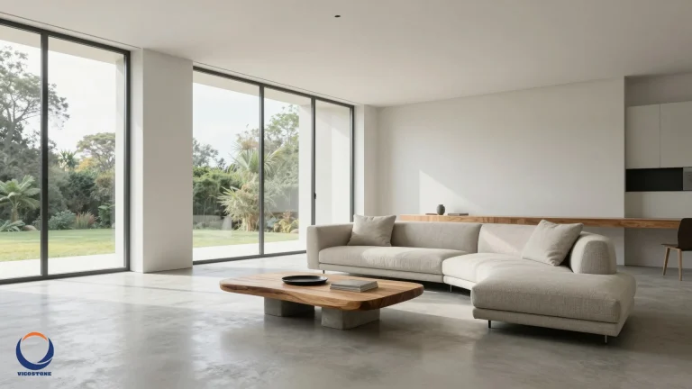
Light neutral colors have a remarkable ability. They can make rooms feel larger and brighter. This is particularly beneficial in smaller spaces. They also work well in areas with limited natural light. White, off-white, and light grey walls reflect light. This maximizes the brightness of a room. It creates an airy and open ambiance.
Open-plan layouts are increasingly popular. They benefit immensely from neutral palettes [1]. These layouts allow for free-flowing movement. They often serve multiple functions. Neutral colors help to unify these diverse zones. They maintain a cohesive and expansive feel. This visual continuity is key. It prevents large spaces from feeling disjointed. It also keeps smaller spaces from feeling cramped.
Designers strategically use neutrals. They enhance a room's natural light. They also create an illusion of greater space. This is a powerful tool. It transforms ordinary rooms into inviting havens. It makes them feel more generous and welcoming.
The role of texture and material
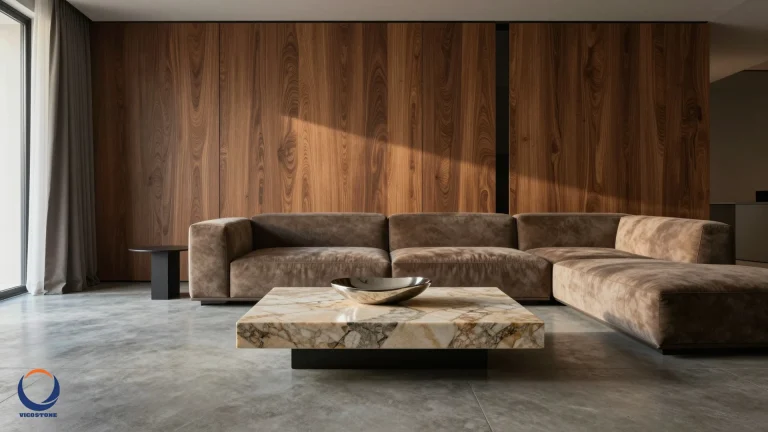
When color is subdued, texture becomes paramount. Neutral palettes allow the tactile qualities of materials to be highlighted. Think of the rich grain of wood. Consider the subtle variations in stone. Imagine the softness of linen. These elements add depth and interest. They do so without relying on bold hues [2].
Natural materials are a key component. They are often paired with neutral designs. Bamboo, wood, and stone are popular choices [1]. These materials offer a clean aesthetic. They also connect us to nature. This connection is deeply rooted in many cultures [1]. The organic textures and eco-friendly nature of materials like bamboo enhance visual appeal. They align with the minimalist philosophy. This philosophy emphasizes simplicity and sustainability [1].
Layering different textures within a neutral scheme creates visual richness. It adds warmth and comfort. For example, a neutral stone lamp offers gentle light. It enhances texture rather than distracting from it [2]. This thoughtful combination elevates the design. It makes the space feel sophisticated and inviting. The best surface finishes for modern minimalist interiors often leverage these principles.
Beyond white: a spectrum of neutrals
Neutral doesn't mean boring. It extends far beyond plain white. The spectrum includes a rich variety of shades. These range from soft greys to warm beiges. They also encompass earthy tones. Designers are increasingly exploring this diversity. They find subtle blends inspired by natural surroundings [1]. Soft greens, muted blues, and beige tones can evoke tranquility [1].
Currently, coffee-inspired hues are gaining popularity [5]. These shades range from creamy lattes to deep espresso. They bring warmth and inviting energy to any room [5]. Designers like Mina Lisanin praise Benjamin Moore's "Swiss Coffee" for its warmth [5]. Valspar's "Savoury Beige" is another favorite. It beautifully complements woodwork and cream furnishings [5]. Farrow & Ball's "Oxford Stone" and Clare Paint's "Dirty Chai" also offer unique undertones [5]. These examples show the depth and variety available. They prove that neutrals can be dynamic and expressive.
Choosing the right neutral involves careful consideration. Undertones are important. Lighting conditions also play a role. A designer's expertise helps select the perfect shade. This ensures the desired mood and aesthetic are achieved. The global language of design, facilitated by tools like Google Translate[3], allows designers to draw inspiration from diverse cultures and apply these universal principles effectively.
Integrating neutrals with other design elements
Neutrals provide a solid foundation. They also allow for creative expression. Designers often introduce accent colors. These add personality and vibrancy. A neutral room can handle bold artwork. It can also accommodate colorful textiles. The neutral backdrop ensures these elements pop. They do not overwhelm the space.
The balance between minimalism and maximalism is key [2]. Minimalism values clarity and calm. Maximalism thrives on warmth and personality [2]. Neutrals can bridge this spectrum. They allow for intentional layering of objects. They also support varied textures. This creates a space that feels personal and lived-in [2]. For example, sculptural foundations like a linen sofa set the tone. They do this without overpowering the room [2].
EON Tech, for instance, provides advanced visualization tools. These help designers experiment with different palettes. They can see how accents interact with neutral bases. This ensures a harmonious and intentional design. The goal is to create a space that tells a story. It should reflect the client's identity. This is achieved through careful curation. It is not about following rigid rules.
Practical considerations for designers
For interior designers, recommending neutral palettes offers several practical advantages. First, it simplifies the decision-making process for clients. The vast array of options can be overwhelming. Neutrals provide a clear, elegant starting point. They are less likely to be regretted over time. This leads to higher client satisfaction.
Furthermore, timeless neutral designs offer long-term value. Clients appreciate spaces that don't require frequent overhauls. This translates to cost savings. It also reduces environmental impact. Designers can educate clients on these benefits. They can highlight the enduring appeal of neutrals. They can also explain their practical advantages. This builds trust and strengthens client relationships.
Finally, neutral designs are versatile for professional portfolios. They showcase a designer's ability. They demonstrate skill in creating sophisticated spaces. These spaces are adaptable to various styles. They also appeal to a wide range of tastes. This broad appeal can attract more diverse projects. It enhances a designer's reputation. Minimalist modern interior design ideas often exemplify these principles.
The enduring appeal of a neutral palette
The preference for neutral tones among interior designers is clear. It is rooted in their inherent benefits. These colors offer psychological comfort. They provide unmatched versatility. They also ensure timeless elegance. Neutrals create spaces that are both beautiful and functional. They adapt to changing needs and tastes. This makes them a wise investment.
From the serene whites to the rich coffee hues, the neutral spectrum is diverse [5]. It offers endless possibilities for creative expression. Designers use these tones as a foundation. They layer textures and materials. They introduce thoughtful accents. This creates environments that are deeply personal. They are also universally appealing. This approach ensures that every space tells a story. It remains relevant for years to come. Understanding the science behind color helps designers make informed choices.
Ultimately, designers choose neutrals for their ability to create enduring beauty. They craft sanctuaries that promote peace and clarity. These spaces stand the test of time. They offer a calm refuge in a bustling world. This makes neutral tones an indispensable tool. They are essential for any designer aiming for timeless design excellence. Exploring the spectrum of design styles reveals how neutrals anchor various aesthetics.
More information
- Minimalist Design: An interior design style characterized by simplicity, clean lines, and a monochromatic palette. It emphasizes functionality, open spaces, and a lack of clutter to create a calm and balanced environment.
- Color Psychology: The study of how different colors affect human behavior, mood, and emotions. In interior design, it informs choices to evoke specific feelings like calm, energy, or sophistication.
- Neutral Tones: Colors such as whites, grays, beiges, and earthy browns that lack strong chromaticity. They serve as versatile backdrops, allowing other design elements to stand out while creating a harmonious and timeless aesthetic.
- Timeless Design: An approach to interior design that focuses on creating spaces that remain aesthetically pleasing and relevant over many years, resisting fleeting trends through classic choices in color, materials, and form.
- Coffee-Inspired Hues: A trend in neutral color palettes that draws inspiration from various shades of coffee, ranging from light creamy lattes to deep, rich espressos, offering warmth and sophistication to interiors.